
Contents
- Choose the delivery canvas before the scene
- Plan 9:16 around a narrow action corridor
- Use 16:9 width for context or travel
- Simplify the 1:1 composition
- Reserve space for the real caption and interface
- Build crop overlays in an ordinary image editor
- Validate the source as a moving shot
- Decide between one master and dedicated sources
- Frequently asked questions
An acceptable source image can produce the wrong video simply because its destination was decided too late. A wide scene may become unreadable on a vertical phone screen; a centered portrait may lose its hands when cropped to square; platform captions may cover the action that justified the shot.
Playbox AI is an Adults 18+ AI video generator for guided image-to-video creation. This article focuses on preparing the source, planning one clear motion, checking the current product options and reviewing the generated clip before a focused retry.
That order matters in any AI Adults 18+ video generator workflow. The ratio determines how large the subject can appear, how far the action can travel, which background areas must exist in the source, and where captions or controls may compete with the scene.
Choose the delivery canvas before the scene
Treat 9:16, 16:9, and 1:1 as different compositions, not three export presets applied to one finished clip.
| Format | Typical destination | Useful composition | Main crop pressure | Motion that is easier to contain |
|---|---|---|---|---|
| 9:16 | Full-screen mobile feeds | One strong subject with vertical depth | Minimal room beside the subject; interface coverage | Restrained push-ins, centered tracking, vertical reveals |
| 16:9 | Widescreen players and desktop viewing | Subject plus meaningful setting or lateral action | Important details may disappear in later vertical crops | Modest pans and movement across the setting |
| 1:1 | Compact or mixed mobile placements | One simplified focal area | Limited spare room on every edge | Short push-ins and small centered movements |
YouTube identifies 16:9 as its standard computer-player ratio. Its player adapts to other ratios and can add padding for some device-and-format combinations. YouTube advises against baking padding or black bars into the file because they interfere with dynamic player resizing (YouTube Help).
Ratio can also affect how a video is categorized. On standard YouTube channels, square or vertical videos up to three minutes long and uploaded on or after October 15, 2024 are categorized as Shorts. YouTube recommends using a wider ratio such as 16:9 when long-form delivery is intended (YouTube Help).
Before preparing the source, write down the primary placement and the details that must survive it: face, hands, a prop, on-image text, or environmental context. If two destinations impose conflicting priorities, that is evidence for separate source compositions rather than a reason to hope one crop will work everywhere.
Plan 9:16 around a narrow action corridor
A 9:16 canvas offers height but very little lateral tolerance. Keep the face and essential action inside a narrow central corridor, with expendable background near both sides. A hand already close to an edge has almost no room to travel outward once animation begins.
The lower frame is not automatically usable just because it is empty in the source image. Captions, descriptions, calls to action, and playback controls may occupy it. Right-side interface controls can create a second obstruction, making the practical safe area both smaller and asymmetrical.
Apply the 9:16 crop before enlarging a full-body source. If the boundary intersects an elbow, hand, or required prop, choose the actual priority: a larger face, wider movement, or complete body context. A severe vertical crop cannot preserve all three. When the face and hand action are both essential, use a wider starting composition, reduce lateral movement, or prepare a dedicated vertical source.
Movement should follow the available clearance. A push-in reduces clearance on every edge. Centered tracking normally has more tolerance than movement across the frame, while handheld-style motion needs spare space for its furthest offset—not merely its starting position.
The Playbox AI first-clip walkthrough recommends beginning with a clear, closer source in which the face retains useful visual information. For format planning, balance that face size against the room required by the intended motion template. A tighter portrait is not better if the movement immediately drives the subject into an interface area or crop boundary.
Use 16:9 width for context or travel
Choose 16:9 when the setting, another point of interest, or lateral movement contributes to the scene. The extra width should supply context, look-room, visual balance, or a real travel path. Empty space that serves none of those purposes merely makes the subject smaller.
An off-center subject can work when the open side supports their gaze or direction of travel. The same composition becomes fragile if a vertical version is also required. Place a centered 9:16 guide over the wide source: if it removes the face, active hands, or the object receiving the subject’s attention, the image is not a dependable multi-format master.
A planned pan also needs usable background throughout its route. If the source image ends immediately beside the body, there is no genuine visual information for the move to reveal. Choose a shorter pan, switch to a restrained push-in, or prepare another source with sufficient background clearance.
For eligible Google Ads campaigns, Google recommends providing separate horizontal 16:9, vertical 9:16, and square 1:1 creatives so they can display appropriately across devices (Google Ads Help). That recommendation does not mean every project requires three sources. It does show why a wide master should not be assumed to produce an equally useful vertical composition.
Simplify the 1:1 composition
A square frame has more width than 9:16 and more height than 16:9, but little surplus in either direction. It works best with one dominant focal area and restrained motion.
A medium shot that feels spacious in 16:9 can become crowded when both sides are removed. A portrait source may instead lose headroom and lower-body context when its top and bottom are trimmed. Judge the image through the actual square boundary rather than its original orientation.
The composition is usually overloaded when the face, moving hands, background objects, and on-image text all compete for the same limited area. Simplify it: remove nonessential text or clutter, reduce movement range, or create a dedicated square source. Do not solve crowding by pushing every element toward the exact center; that preserves visibility but often destroys separation between the subject and the action.
Delivery can introduce an additional crop. Google documents that interaction with surrounding content in the YouTube app can compress a vertical or square player to 1:1 and crop the displayed video at the top and bottom (Google Ads Help). A face, hand, or title close to those edges may therefore disappear even when the original frame looks comfortable.
Reserve space for the real caption and interface
There is no defensible universal rule such as “leave the lower 20% empty.” Usable space changes with the ratio, device, caption length, placement type, controls, and additional interface elements.
TikTok states that its in-feed safe zone varies with the video dimensions, caption length, and additional formats. It also warns that a preview not tied to a specific device may differ slightly from the live presentation (TikTok for Business). Validate representative caption copy and the relevant controls rather than checking a clean frame.
TikTok’s documented TopView behavior provides a concrete delivery example. A 9:16 asset initially appears in a full-screen opening stage. When replayed in the feed, it is readapted to the in-feed display area with the TikTok interface, so the same asset visibly occupies a different usable canvas. TikTok consequently provides separate safe-zone material for the opening and in-feed stages, notes that longer captions shrink the safe zone, and recommends previews across device models (TikTok TopView specifications).
The practical lesson comes from that observed presentation change: a subject can clear the uncluttered opening yet conflict with lower captions or right-side controls during replay. For a source intended for comparable vertical delivery, overlay both relevant platform guides on the same image. If a required hand, prop, face, or line of text crosses either protected boundary, move it into the area shared by both guides, shorten motion toward the obstruction, or choose another composition. Approval requires the essential details to survive both views with the intended caption length represented.
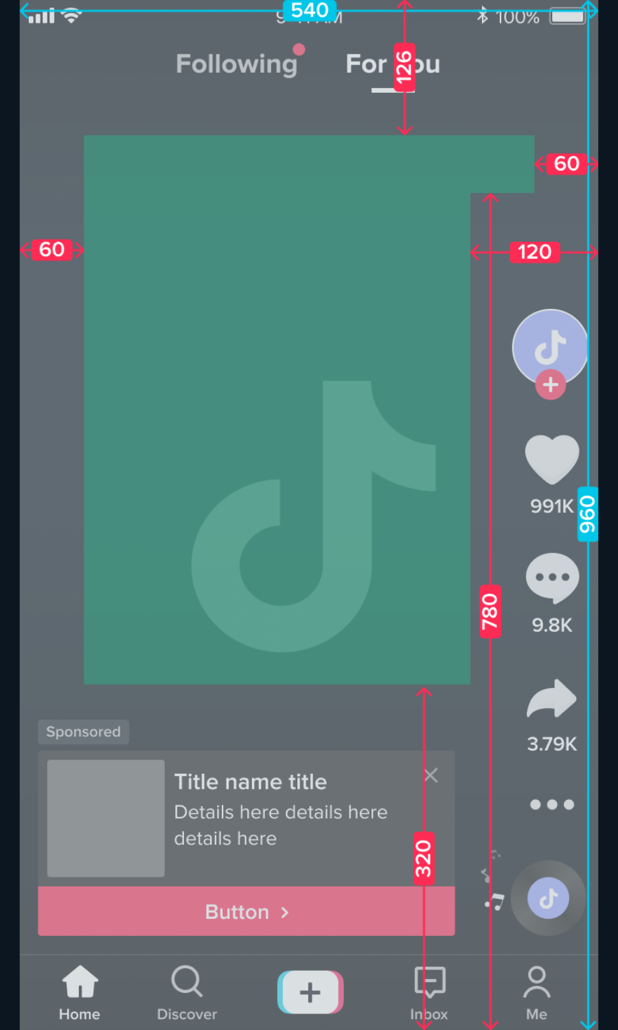
TikTok’s in-feed interface leaves an asymmetric usable area within the 9:16 frame.
Build crop overlays in an ordinary image editor
A reproducible overlay check does not require a generator-specific feature:
- Duplicate the original source so the master remains untouched.
- Create centered crop guides for 9:16, 1:1, and 16:9 on separate layers.
- Give each guide a different outline color and add a translucent shade outside its retained area.
- Mark the face, active hands, required props, and planned caption area on another layer.
- Toggle the guides individually and record which essential elements cross a crop or interface boundary.
Do not enlarge the image independently for every guide during this comparison. Keeping one consistent subject scale reveals whether a shared master truly works. If the 9:16 guide requires a major enlargement while 16:9 needs environmental context, the formats are asking for different compositions.
The overlay also exposes missing source information. A limb or accessory already cut off by the original edge cannot be recovered through reframing. Likewise, a pan cannot reveal authentic background that the source never contained. These are source-selection problems, not export problems.
Validate the source as a moving shot
Format approval should happen before the Playbox AI editorial workflow advances from source selection to motion-template choice. Inspect five things:
- Native orientation: Confirm that the target crop retains enough useful pixels and does not depend on baked-in bars.
- Subject clearance: Check the face and head against the top boundary and both sides of the body against lateral crops.
- Limb and prop boundaries: Flag anything already touching an edge or likely to cross it during movement.
- Background extension: Verify that the planned pan or tracking path contains real, coherent background.
- Interface clearance: Test the actual caption treatment and destination-specific overlays, not a generic empty strip.
Then assess three positions rather than approving only the starting still: the opening frame, the widest movement, and the likely end frame. Duplicate the crop mock-up for each position. For a push-in, enlarge the subject to the closest planned view. For a pan or tracking move, shift the subject to the furthest planned position. The plan passes only when every position preserves the focal subject, required action, crop clearance, and interface-safe space.
This check also helps with template selection. A source with narrow side clearance calls for low lateral displacement. A composition with limited headroom should avoid a strong push-in. If the planned motion exposes the same kinds of edge or continuity problems discussed in the Playbox AI artefact guide, revising the source or choosing gentler movement is more reliable than expecting a later crop to conceal them.
After the planning mock-up passes, compare it with the current Playbox AI interface’s current input preview and available controls. Because those controls have not been verified here, use their visible names and behavior as presented at the time. If the preview scales or crops the image differently, revise the prepared source and repeat the opening, widest, and end-position checks.
Decide between one master and dedicated sources
One master is reasonable when a single focal subject remains large enough in 16:9, centered enough for 9:16, uncluttered enough for 1:1, and surrounded by expendable background. Restrained, centrally contained motion makes that approach more resilient.
Prepare dedicated sources when widescreen context carries meaning, the vertical delivery needs a substantially closer view, captions compete with the action, or an essential detail falls outside the narrowest crop. Separate compositions require more preparation, but they resolve structural conflicts before generation rather than forcing an otherwise usable clip through a damaging crop afterward.
Before continuing, record the primary destination, delivery ratio, essential details, caption mode, motion direction, maximum displacement, and pass-or-fail result for the opening, widest, and end positions. Then label the source as either a shared master or a format-specific composition. That short approval record keeps ratio, source crop, and motion-template choice connected throughout the Playbox AI planning workflow.
Frequently asked questions
Which ratio should I choose if I am unsure?
Decide where the clip will be watched first. Full-screen vertical feeds point to 9:16, widescreen players to 16:9 and mixed placements to 1:1. The About page notes that 1:1 and 16:9 sources tend to behave most predictably in the product, but check the live preview for the options currently offered.
Can one source image serve all three formats?
Sometimes. One master works when the subject stays large enough in 16:9, centred enough for 9:16 and uncluttered enough for 1:1, with expendable background around it and restrained motion. If any crop removes the face, active hands or a key prop, prepare a dedicated source for that format.
Should I add black bars or padding to the source?
No. Baked-in bars and padding waste useful pixels and can interfere with how players resize the video. Prepare the source at the native ratio you want to deliver.
How do I check caption and interface safe zones?
Overlay real caption copy and the relevant platform guides on the source, then check the opening frame, the widest point of the movement and the likely end frame. Usable space varies with device, caption length and placement, so a fixed percentage rule is not reliable.
How does ratio affect the motion I can request?
Narrow canvases leave little lateral room, so favour centred, restrained movement. A push-in reduces clearance on every edge, and a pan needs real background to reveal. The templates versus custom prompts guide shows how to match movement to the crop.